Overview
Fitness branding runs on intensity. Condensed type, shouted verbs, before-and-after arithmetic. PulseClub's founders were building the opposite: a gym where progress means showing up weekly, adjusting the pace, and noticing how each day feels a little different from the last. The identity had to signal effort without aggression and calm without softness, a narrow lane with cliff edges on both sides.
Solution
The name holds the whole position. Pulse is the body's quietest constant, proof of effort that never shouts, and Club reframes membership as belonging rather than subscription.
Process
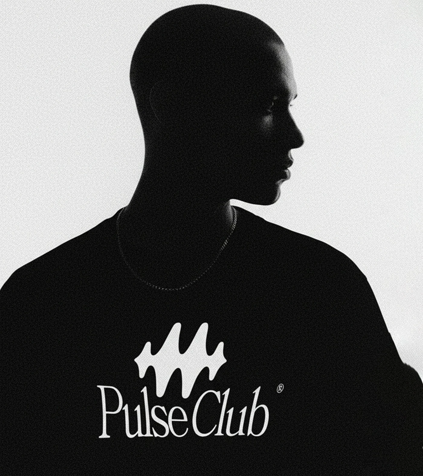
Naming ran the first three weeks: 54 candidates, screened down through two rounds with the founders, trademark checks on the final three. Weeks four to seven were identity, where the glyph went through 60 drawn passes before the version that read as a pulse at ten meters and a scribble of energy up close. We tested every candidate on a printed shirt before showing it on a screen, because the chest print was always going to be the brand's real home.





Final Thoughts
PulseClub opened with 300 founding memberships gone before the doors did, and the first merch run sold out to people who had never set foot in the gym, which says the identity works as belonging before it works as marketing. The in-house team has run the system solo since week one.