Overview
Pet retail is drowning in paw prints, pastels, and puns. Russells was opening a flagship store and grooming studio in a neighborhood of design-literate owners, selling considered gear and its own food and treat line. The founders wanted a brand their customers would respect as much as the studios and cafes next door, without tipping into coldness.
Solution
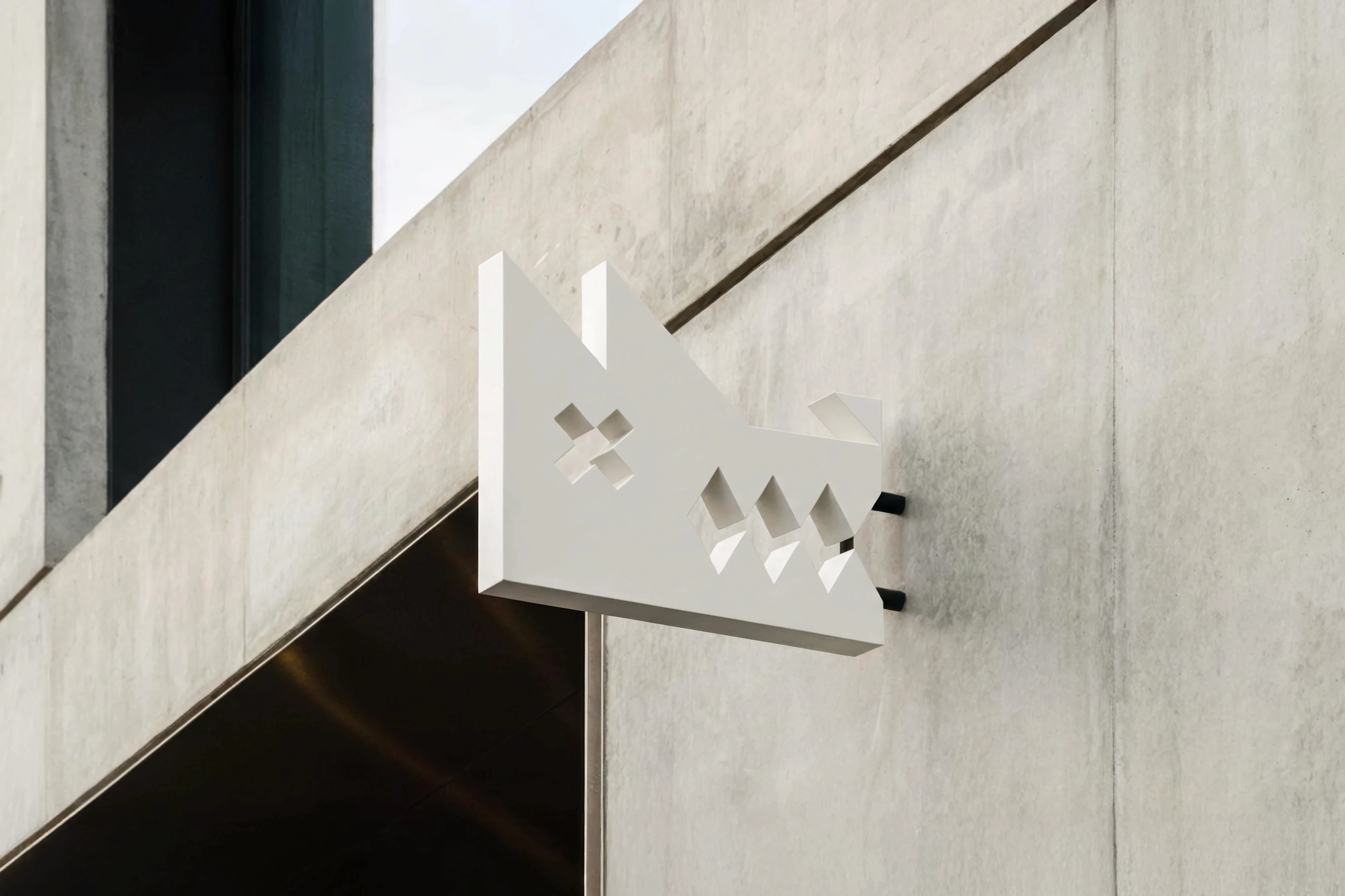
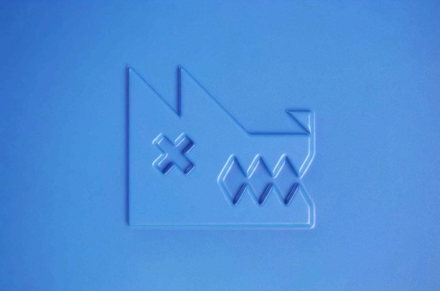
The name came from the shop dog, a Jack Russell named after nobody, and it gave the brand a family surname's confidence: Russells, like a business that has been on this corner for decades. The mark is the warmth valve turned exactly halfway, a hound's head built from hard angles, an X for an eye and diamonds for teeth, fierce at first glance and a grin at the second.
Process
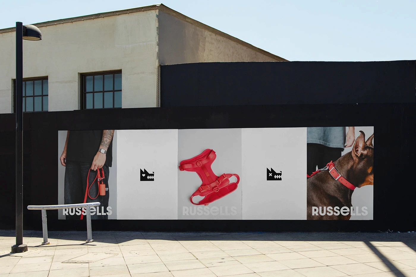
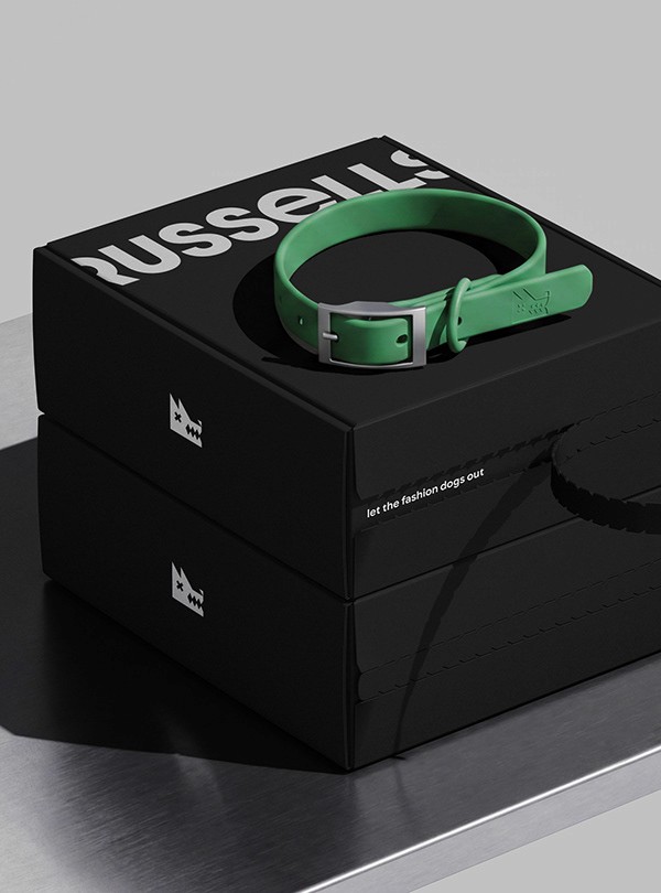
Weeks one and two settled the name and registered it without drama. The mark took four weeks and roughly 90 passes, most of them spent tuning the single question of how sharp the teeth could be before the grin disappeared. We tested at three scales throughout: facade, package, and stamp, because a mark that only works at one size is a logo, not an identity.


Final Thoughts
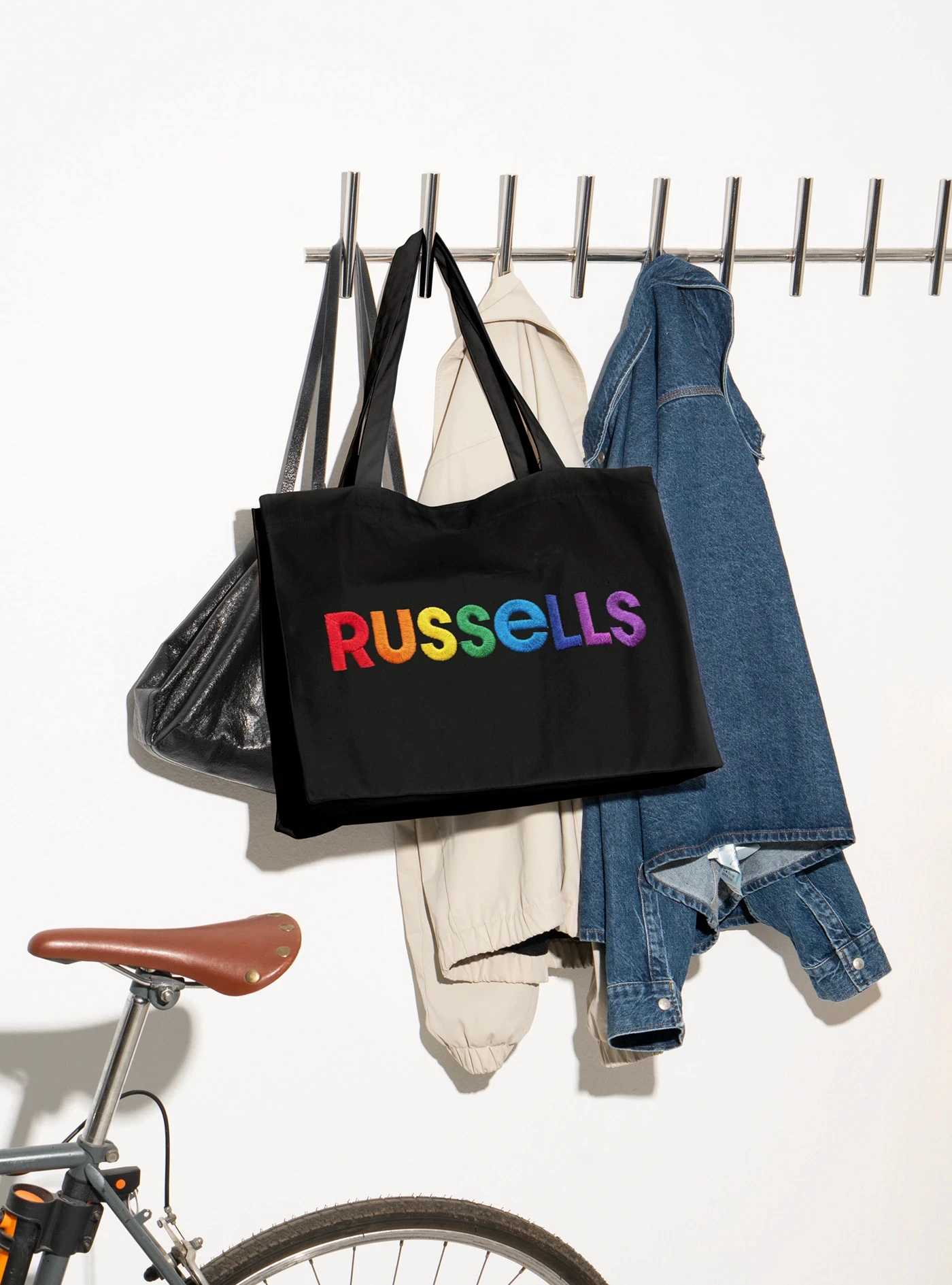
Russells opened to a queue with dogs in it, and the own-label treat line became the store's best seller within the first month, outperforming the brands it shares shelves with. The sign is now a local landmark and has its own geotag, which no one planned and no one is complaining about.