Overview
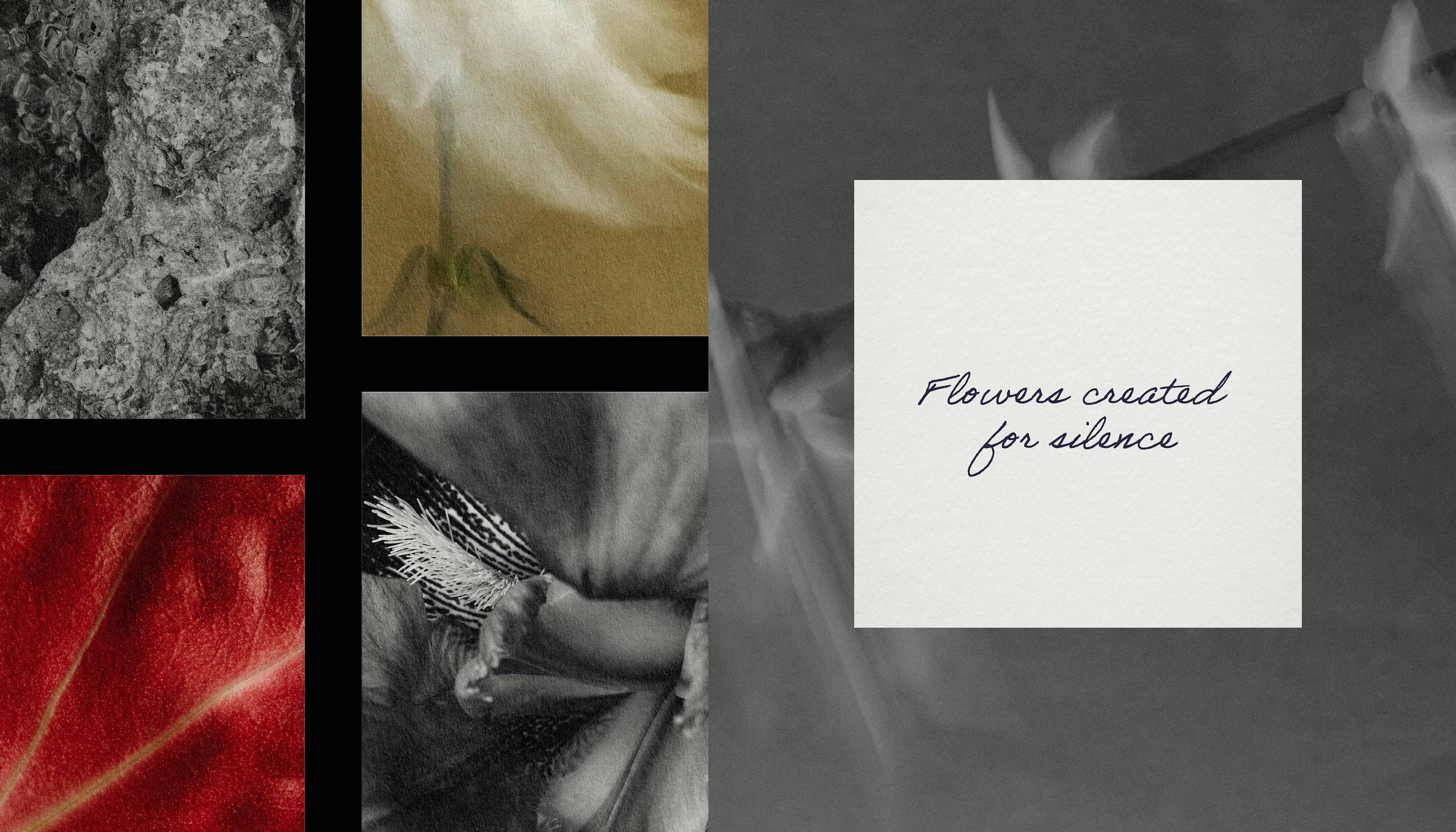
Flower branding defaults to prettiness: pastel palettes, script fonts, watercolor everything. Kano's founder trained in ikebana and builds arrangements closer to sculpture than bouquet, sold to restaurants, hotels, and galleries rather than weddings. The identity had to signal that difference instantly, reading as an art practice with a delivery van, not a florist with ambitions.
Solution
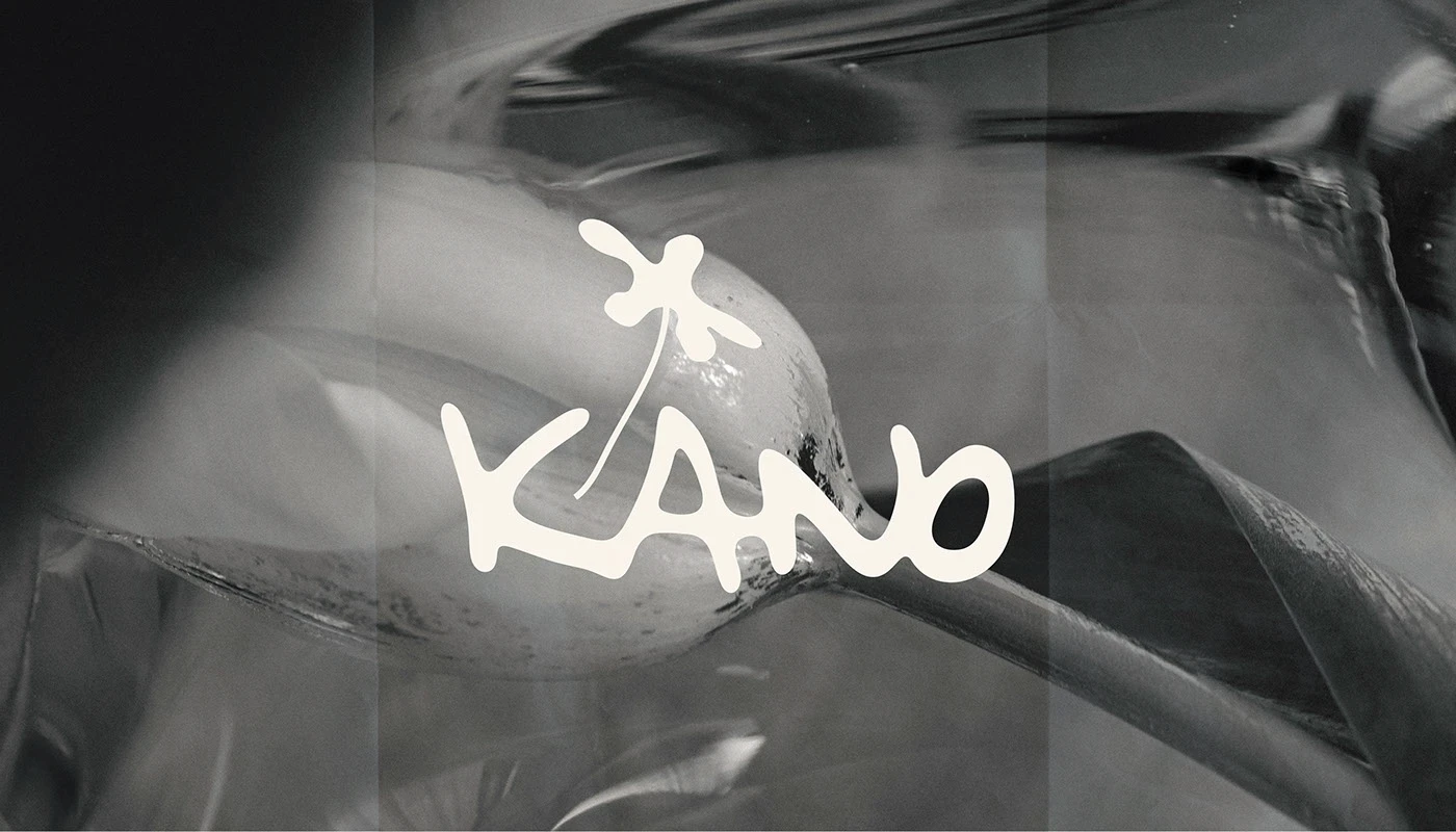
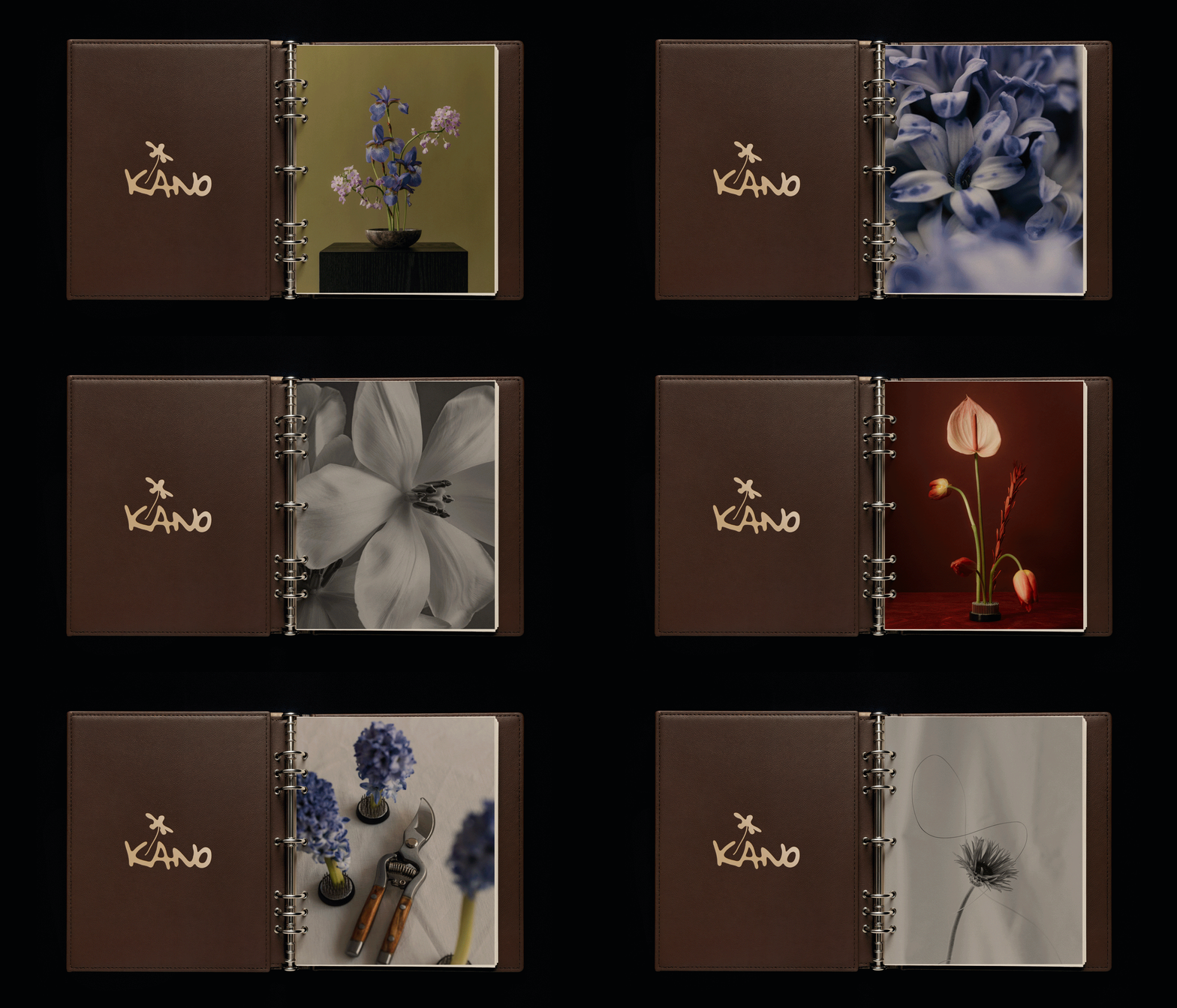
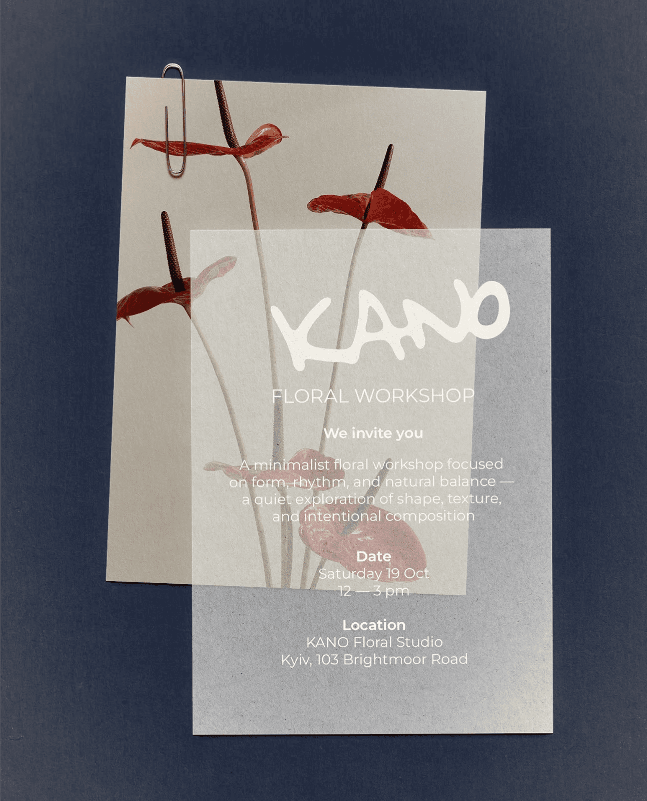
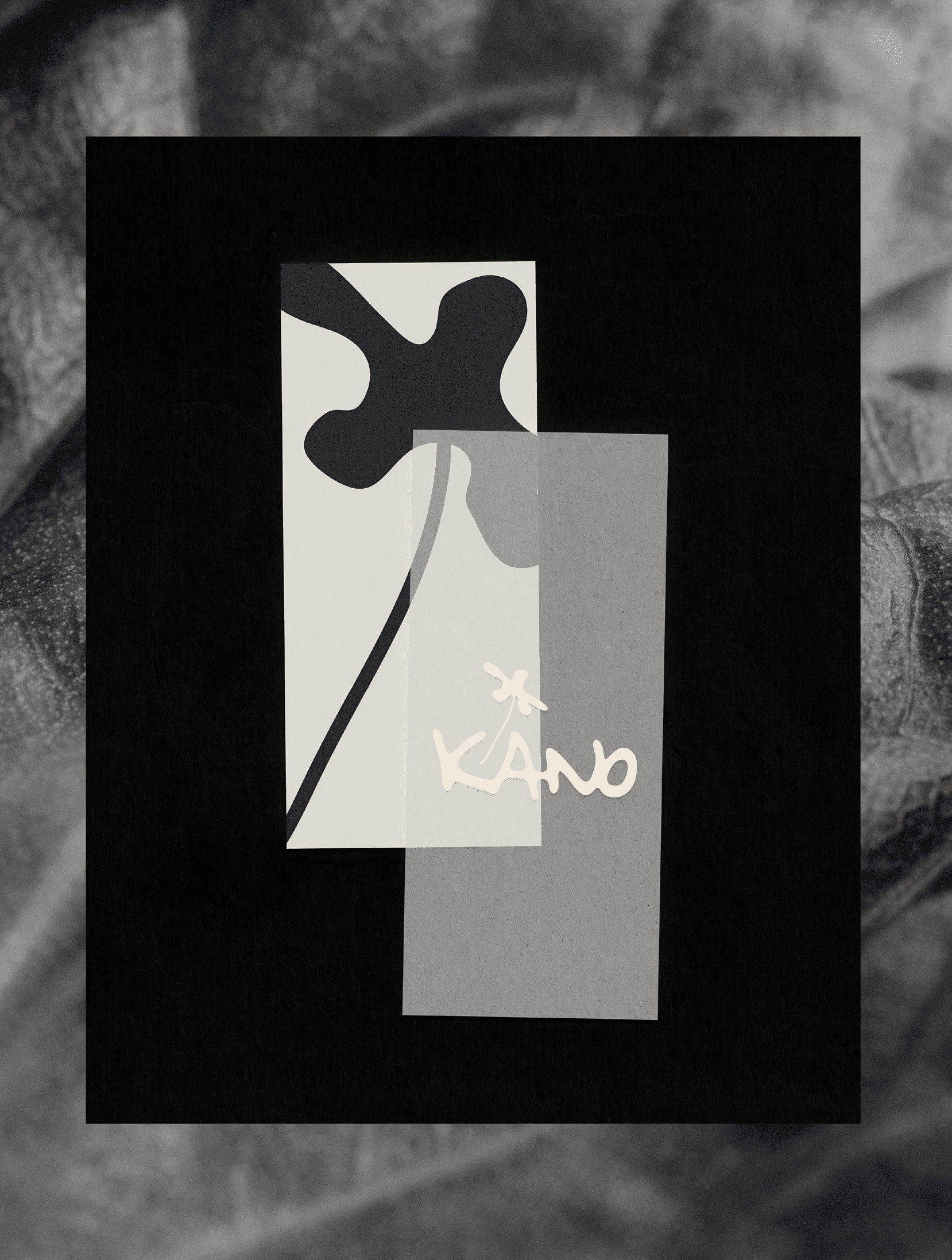
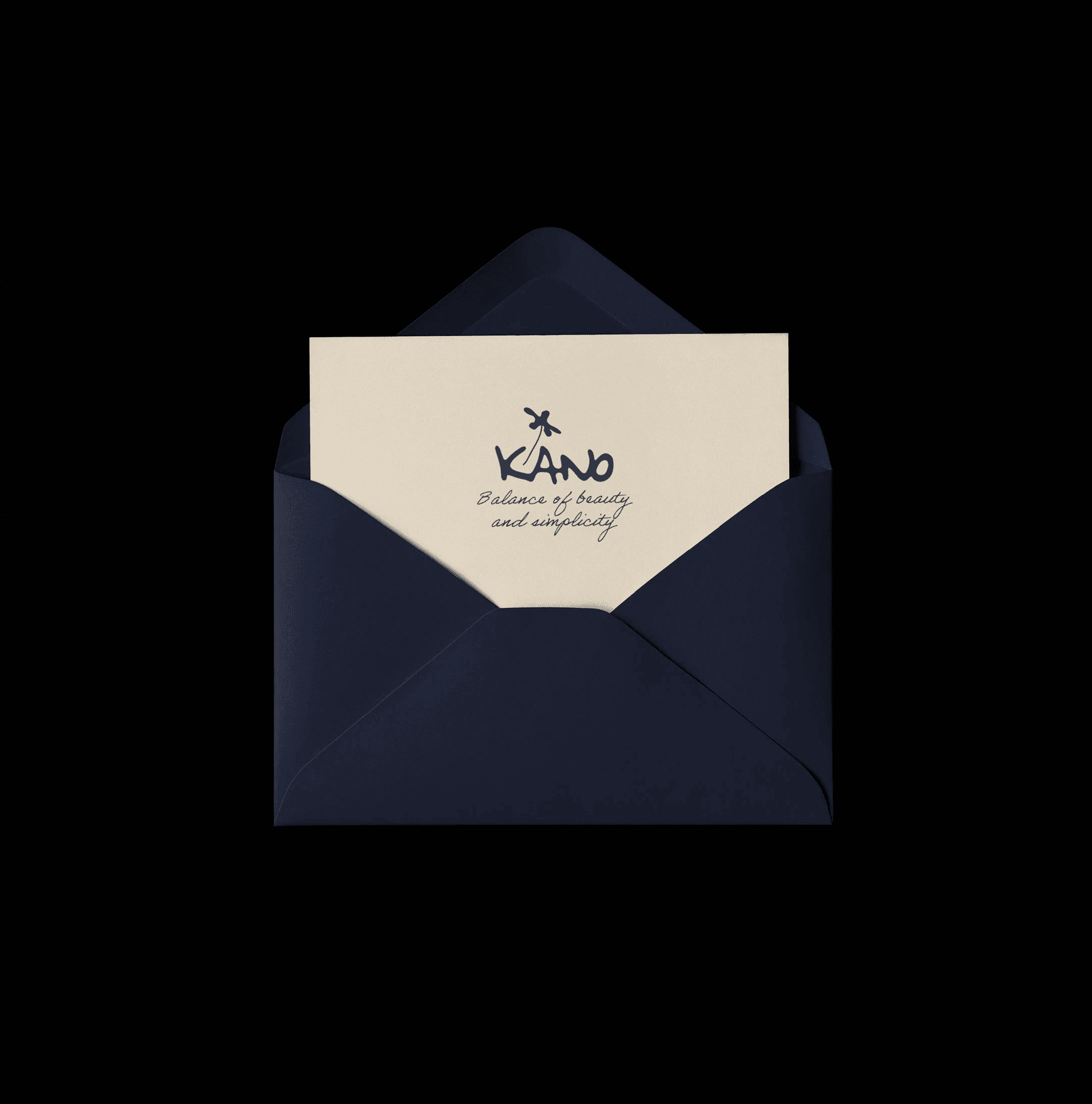
The name is short, planted, and slightly unfamiliar, and the wordmark is drawn by hand in a single sitting of passes until the letters moved like stems, with a bloom glyph sprouting from the K that works alone as the studio's stamp on wrap, ribbon, and cards. The mark carries all the softness the brand will ever need, which freed everything else to be severe.
Process
Naming took the first two weeks: 40 candidates pushed through sound and meaning checks across the studio's three client languages, with the final pick surviving every room it was said aloud in. Weeks three and four were the mark, roughly 120 drawn passes, then the bloom glyph separated out and tested at stamp size on kraft wrap before anything went digital.


Final Thoughts
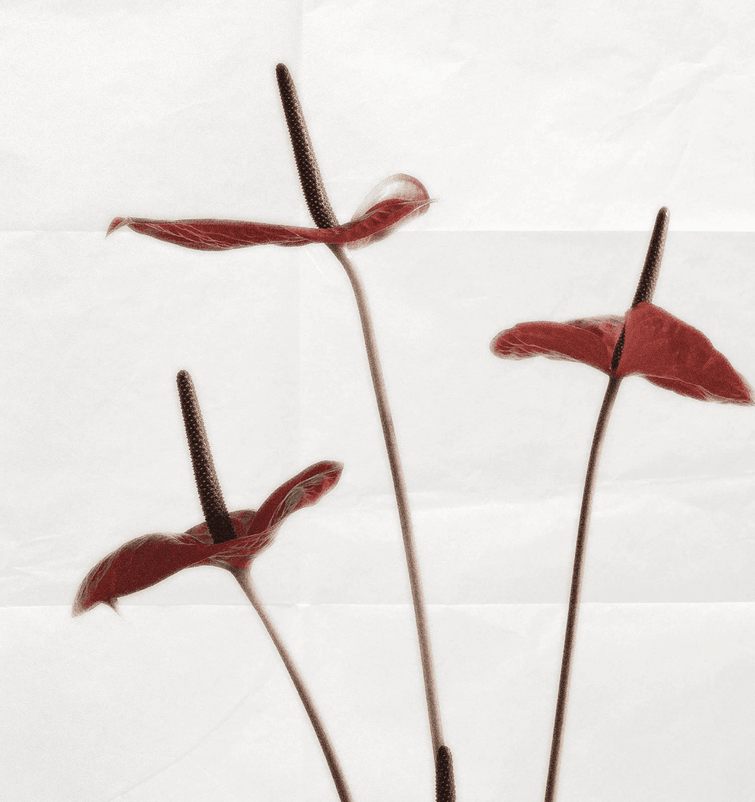
Kano rebranded on a Monday and had its first gallery commission by that Friday, from a curator who said the Instagram grid looked like an exhibition. Walk-in trade held steady, which was the balance the whole brief hinged on. The founder now stamps the bloom glyph on everything that leaves the studio, including the invoices.